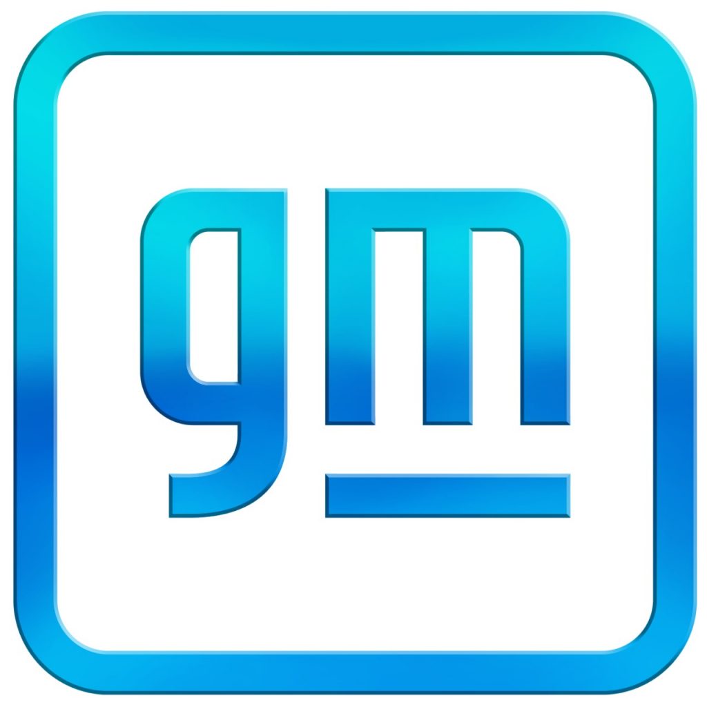
The familiar square GM block logo is getting a makeover in 2021, General Motors announced today. The new logo features lower case letters, a color gradient, and rounded edges. The underscore remains, albeit slightly truncated.
The new logo is part of a larger “Everybody In” campaign launched by General Motors to demonstrate its commitment to electric vehicles and other emerging technologies.
“There are moments in history when everything changes. Inflection points. We believe such a point is upon us for the mass adoption of electric vehicles,” said Deborah Wahl, GM global chief marketing officer. “Unlike ever before, we have the solutions, capability, technology and scale to put everyone in an EV. Our new brand identity and campaign are designed to reflect this.”
In the press release, GM also alluded to its “Ultium” platform, which the General says will eventually power 30 new electric vehicle models, including some already poised to hit showrooms (like the GMC Hummer EV). GM says Ultium will help deliver an electric vehicle that can go an estimated 450 miles on a single charge.
You can read more about the General Motors “Everybody In” campaign in the official press release here.

[…] The familiar square GM block logo is getting a makeover in 2021, General Motors announced today. The new logo features lower case letters, a color gradient, and rounded edges. The […] Read full article at http://www.onallcylinders.com […]
What wimp came up with this? Can you say New Coke?
POOR CHOICE – PROBABLY A YOUNGER GENERATION OF FOLKS THAT THOUGHT THIS UP. THE OLD GM SYMBOL IS CERTAINLY MORE RECOGNIZABLE AROUND THE WORLD THAN THIS “NEW ONE”. WAY TOO MANY OLDER GM VEHICLES IN USE AROUND THE WORLD TO LOOSE THIS IDENTIDY!! IF IT AINT BROKE – WHY FIX IT????? BOB
In total agreement with Bob, IF IT AIN’T BROKE….
And in typical corporate fashion, GM probably hired a outside “consulting” firm that charged a seven digit fee to upgrade the appearance of the original GM logo that has withstood the test of time quite nicely.
My preference is of the blue oval persuasion but I definitely do not see the need for this particular change.
Change is constant, rust never sleeps, a nod is as good as a wink to a blind horse…. and the beat goes on…..
New logo will look good on a vehicle being driven by a guy with a man bun.
So it’s lowercase?? The original logo was made of Capitals.. the start of a statement the start of a word and every thing else follows the capital letter.. so you went from a capital leading letter to a lowercase follower… dumb
It all started with “children” that were ignorant of history.
[…] on the heels of its new “Everybody In” vision to get more folks in electric vehicles, GM doubled down on battery electric vehicles […]
[…] off the announcement of its new logo and marketing campaign, GM took its electrified message to the annual Consumer Electronics Show […]
[…] this month, General Motors revealed a redesigned GM logo—which got us thinking about some of the more memorable automobile brand […]
[…] entirely surprising—GM has been clear that its future plans involve a lot of electrification. A logo change and some major reveals at this year’s Consumer Electronics Show preceded today’s […]